At Picnic we sell a very wide assortment of products. For all of these products, we produce sales forecasts to understand how much we need to order from our suppliers in order to meet customer demand.
Some of these products move off the metaphorical shelves extremely quickly — you can imagine that many families want to replenish their milk, bread and banana stocks on a regular basis. Utilising a bit of linguistic flourish, we call these products extreme fast movers; products where we place orders with our suppliers multiple times per day.
On the other end of the spectrum, we have the type of article that if you need it, you really need it, but you would only buy very infrequently. Batteries, cheese knives and the like. In these cases we may only resupply once a week (or less) and a single order from a supplier needs to cover customer demand for a longer range of time. These articles we call slow movers.
Already we’re running into a challenge. Our ordering needs span a large hierarchy of granularities. For some articles we need fine grained predictions in order to describe the difference between demand on Monday and a Tuesday. But many articles are ordered on a longer timespan, for these a weekly granularity would be more than enough.
This is further complicated by our need to split our forecast over different geographical regions. Our delivery hubs service different areas that can have differing local demand for goods. In order to make sure our warehouses are sufficiently stocked, we need to know how article demand varies on a region-by-region basis.
To date, our demand forecasting system has been based on a bottom-up approach. We forecast on a fine granularity then aggregate up to the level of interest. This keeps us flexible but gives us a number of tricky challenges that we need to bear in mind.
In this blog we’ll discuss what you need to bear in mind in terms of scale and granularity when designing or evaluating forecasting systems, to make sure that your results are working in a way that’s aligned with business needs. Ultimately this is a story about how careful attention to evaluation can point you towards simple changes with a big performance impact.
The trouble with granularity
Model as coarsely as you can get away with.
Is a pretty good rule of thumb for any modeller. Of course, the art of it lies in finding out exactly how much you can get away with.
It’s worth thinking of your predictions as being made of a few different components. A simplistic but useful formulation looks like

Here our predictions, y_pred are centred on the true value y_true but they are offset by two types of error. The first, ϵ_noise encodes an error that you make because your data is noisy. The second, ϵ_model is an error due to imperfections of the predictive model itself, perhaps due to insufficiency in data or model flexibility. The choice of modelling granularity has a pretty critical influence on the balance between these types of errors. Let’s spend some time to dig into them and understand how they interact.
Signal and noise
Noise comes in many shapes and guises, but there are two important features that are pretty common:
- Noise in your data is very hard, if not impossible, to predict.
- The impact of noise is typically larger at finer granularity.
In the case of demand forecasting you’re usually forecasting counts, and for count data, under a few reasonable assumptions, the Poisson model provides a practical framework for describing how noise in your data will behave.
We won’t discuss the model in depth here, but here’s the gist: if your customers are ordering an item independently of each other, then you can expect to have some noise in your daily sales. If you’ve got an item that is making on average five sales per day, you won’t see exactly five sales on every individual day, as that would require your customers to be conspiring with each other to ensure that each day we didn’t have greater or fewer than five orders.
As our customers are not on the phone to each other to organise when to place their orders, there is some intrinsic random variation in the time between orders that leads to Poisson noise in the dataset.
For an average of λ sales per day, you can expect to see a fractional daily variation in your orders of around[1]

Crucially, the impact of this noise decreases as the rate λ increases. So say we’re selling λ=10 cheese knives per day on average, the expected level of Poisson noise would be around 0.32 or 32%. As we scale up the demand, making λ=100, our relative level of noise decreases to 0.1 or 10%.
The sting in the tail: this noise cannot be predicted. We can model how large the prediction error due to noise is likely to be on average, but no technology short of time-travel can help us actually predict it. The noise represents a fundamental bound on how accurate your predictions can be.
Risks and challenges of noise
A noisy dataset means you need to pick (and interpret) your performance metrics very carefully. Let’s take an example from Picnic, where we look at the performance of a two-week forecast for an actual article.

We have a few ways to evaluate this. The immediate one is to look at the predictions at the forecasting grain (daily) and compute performance metrics. This is a very natural instinct for a modeller, we want to take our predictions and assess how well they match reality.
Let’s consider the Weighted Average Percentage Error (WAPE), a common metric in supply chain forecasting. At day-level, the WAPE is defined as

where the i denotes the prediction for the ith day in the series. When computing the WAPE at day-level for the above article, we get

A 24% error may not feel like a great result, but we need to bear in mind that our data is affected by a noise component that we can’t do much about. Let’s connect this result to the business context: we only place an order to restock the article once every two weeks, so in practice what we’re really interested in is the error we make cumulatively summing over the whole period:

Computing the same metric but this time comparing all sales over the period to the time-aggregated forecast, we get

which gives a completely different impression of the overall performance of the model. This isn’t an accident, it’s a consequence of the ϵ_noise error being uncorrelated, while you may make significant errors on the basis of a fine granularity view, these partially cancel out when aggregated.
The takeaway here is that seemingly poor metrics at a very fine grain isn’t a modelling problem per se; even a perfect model may exhibit this. The problem arises in interpretation. If your accuracy metrics are disappointing, this can lead you (or your stakeholders) to believe that forecasting performance is poor even if you are already close to an optimal forecast.
It also muddies on-going model evaluation. Quite reasonable questions such as “What would a good WAPE be?” become hard to answer. Noise-sensitive metrics can suddenly worsen when a lot of new slow moving product lines (and thus, a lot of noise) are added to the assortment. A change in granularity can make metrics improve or deteriorate. Fundamentally, in the high-noise regime, these metrics become more a description of the dataset than a measure of forecasting skill.
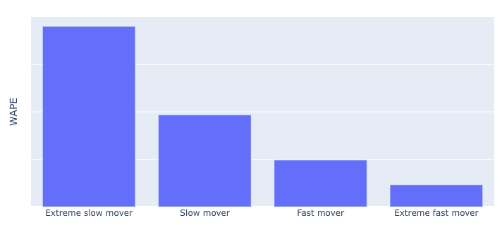
For example, consider how day-level WAPE varies across our fast and slow moving articles. Here we see that WAPE is much worse for our slow movers. But with this metric only, it’s hard to tell how much of this is driven by modelling effects within our control (ϵ_model) and how much is driven by effects that are out of our control (ϵ_noise).
How to get unstuck
Like in many problems, here we have mitigations and we have fixes [2].
A pretty good mitigation is to use metrics that take the intrinsic difficulty of the forecasting problem into account. The Mean Absolute Scaled Error (MASE) family is a good example here. With MASE instead of computing some absolute metric of performance, you measure performance relative to a baseline forecast. So instead of being “40% accurate” you are “20% better than the baseline”. As both the forecast and the baseline are afflicted with the same noise, you can obtain an accuracy measure that targets the ϵ_model error rather than ϵ_noise. This is in general a much better indication of a model’s forecasting skill.

As we can see above, MASE computed over the same split as in our previous figure shows that forecasting skill is actually not deteriorating for the slowest moving articles. The difference being that in our WAPE figure, we show that the underlying forecast problem is simply harder for slow and extremely slow movers. With this view we get a very interesting perspective, that there may be more performance to gain in modelling the fastest moving articles than in the slower ones.
These are good model performance metrics but can feel a bit detached from business needs. Ultimately the number one piece of advice and the only real fix is to always evaluate your performance metrics at the aggregation level at which they are used. Although that may be easier said than done in models where you have a lot of different downstream applications and very dynamic needs in terms of granularity.
Correlation
Noise is a problem that’s most acute when modelling at a fine granularity, and typically reduces when you aggregate. Unfortunately for us modellers though, this isn’t always the case with errors! Let’s consider for a moment the ϵ_model part of our error and how this behaves under aggregation.
Imagine your model is making predictions for article sales per city, and you want to sum up these predictions to see how much demand for an article we expect nationwide.

Models can behave in surprising ways when their outputs are aggregated. In the above figure, we have two models making predictions for a set of data points. If we were to look at the accuracy of individual predictions, most metrics here would report that the performance of the two models is about the same. However if we look at the aggregated predictions, we’d see that model B outperforms model A rather dramatically.
Model B is making an uncorrelated error. Uncorrelated errors (like the aforementioned noise) tend to get smaller when we aggregate them, because the errors point in different directions and can partially cancel each other out. In the case of Model A, we’re making an error that is correlated across its predictions, the errors are all pointing in the same direction.
When modelling at a fine granularity, it can be very important to understand the degree to which your errors are correlated between predictions. This becomes critical in cases where you want to make decisions based on aggregates. If you’re evaluating your models purely at the level of granularity that you output (and not on aggregates) this kind of error may be invisible to you.
Diagnosis
There are many technical measures of error correlation that you can usefully deploy, but it’s important to remain connected to how your model is being applied.
If your relative performance metrics (e.g MAPE/WAPE) tend to improve a lot when you aggregate to a level of interest, that indicates that some kind of uncorrelated error is dominating. If they do not, then a correlated ϵ_model is more the worry. But bear in mind, this is only a problem for you if you are interested in the aggregate quantities! A small correlated error is better than a large uncorrelated error if you are only interested in the fine grain, and vice-versa if you are interested in aggregates. After all, all models have some sort of bias, we just need to get those biases to work for us.
Much like the case of noise, it’s important to keep evaluating your model outputs at all the levels of granularity that you are interested in.
Mitigation
There is a great deal of literature on the modelling of errors and their correlations, this is an area where you can go down the rabbit hole quickly.
The good news is, there is often a shortcut in simply modelling all the aggregation levels of interest. Rather than aiming for a single model at fine grain where you aggregate to higher levels, you simply have multiple models, each targeting a different level in your aggregation hierarchy.
Now, this may not seem like much of a shortcut, you may end up adding rather a lot of models to your stack, furthermore needing to start doing things like hierarchical reconciliation to keep everything coherent. Depending on the use-case it may be better to attempt to model the correlation structure, but modelling correlation structures is a generically hard problem. Sometimes, the best approach to hard problems is to avoid having them.
Stories from Picnic
As previously mentioned, at Picnic we are dealing with huge hierarchies of scale. From AA battery demand at the neighbourhood level, to milk and eggs at a national scale.
We’ve gone through a careful process of evaluating the granularity at which our forecasting models were being used. A more involved study than you might expect, given the many ways in which demand forecasts are used at Picnic. Lessons learned from this analysis have informed a few big changes in our modelling process in recent months.
Our stock ordering systems require forecasts at the half-day level. This felt therefore like the natural level of granularity for our forecasting models. However our analysis revealed that forecasts were almost always aggregated up in placing an order to cover multiple days of demand.
We experimented with moving a little higher in the hierarchy of scales, to day-level rather than half-day and then splitting the results back into half-days in a post-processing step to meet the requirements of downstream systems.
In doing so we were able to give our base forecasting model a dataset that was less influenced by noise, and avoided a few sources of correlated errors. A seemingly simple change, but with a big impact.
By moving to a higher granularity, we were able to half the overall size of the model dataset, along with removing code complexity related to retrieving and processing data at the finer level of detail. By forecasting more closely to the granularity that mattered, we were also able to reduce the impact of noise in our dataset (by reducing ϵ_noise) along with improving a systematic under-forecasting problem that was troubling earlier versions of our forecast (by reducing ϵ_model).
Takeaways
As we started, so we shall finish,
Model as coarsely as you can get away with
is a pretty good rule of thumb! Modelling on too fine a grain can cause issues when your evaluation metrics become more driven by noise rather than factors within your control. Further, aggregating fine grained predictions comes with its own risks in accumulating error via unmodelled correlations.
Forecasting at the granularity you really need is the best option, but sometimes you really need a very fine granularity and need to bite the noisy bullet. In which case there are a few sensible best-practices to stick with:
- Understand what is in your control and what is not.
Are your metrics driven by factors outside of your control as a forecaster? If so, try to develop a panel of metrics which take this into account. - Measure performance at the scale that your forecasts are used, not at the scale they are made.
Sometimes easier said than done, but always worth taking a look at how your predictions behave at different aggregations.
At Picnic keeping on top of these details enables us to provide better forecasts for ordering products, determining required staffing levels, and organising our warehouses.
While we’ve got a lot of battle-tested infrastructure in place, we’re still very much actively developing our forecasting infrastructure. Picnic is a very dynamic business, with new initiatives, a changing assortment, targeted promotions and more meaning that forecasting needs to be continuously reviewed and developed. Maintaining a clear eye on how our metrics should be interpreted is an important part of that.
The combination of an interesting correlation and noise structure with the need for a very dynamic level of granularity makes it a particularly interesting challenge for Machine Learning Engineers.
Footnotes
[1]: In practice this is usually more of a lower-bound on the kind of variation you can expect.
[2]: Noise is an area where probabilistic forecasting models have a lot of natural defence mechanisms, however for the purpose of this blog we’ll focus on evaluating point-forecasts.
Signal vs Noise: Choosing the right granularity for demand forecasting was originally published in Picnic Engineering on Medium, where people are continuing the conversation by highlighting and responding to this story.


 Eric Smith