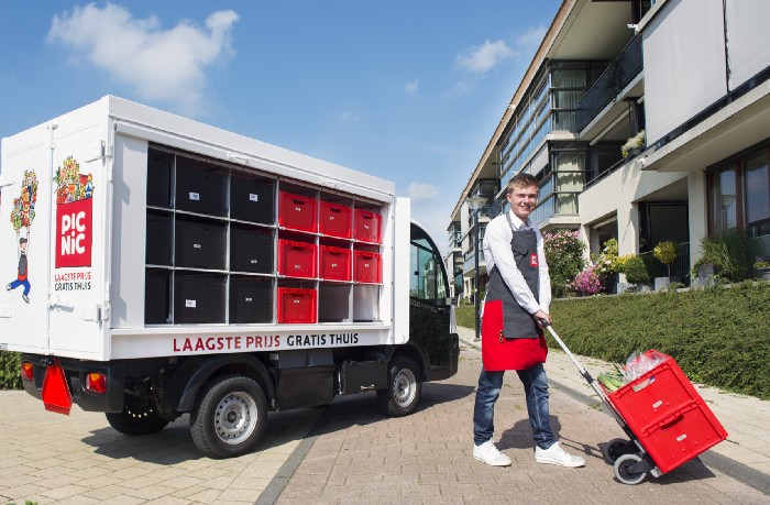
Picnic delivers groceries to thousands of customers every day. In order to do so both efficiently and effectively, Picnic’s distribution system needs to be as smooth as possible. One part of this system is the vehicle routing model, that determines which routes are optimal given the customers and their placed orders, amongst other factors. An important input into this model is the drop time: how much time we expect a delivery to take for a given customer (in the vehicle routing literature better known as the service completion time). This blog post covers why drop times are so important and how we, the Data Science team within Picnic, developed a model to better predict this amount of time.
Time is of the essence
Customers value the convenience of having their groceries delivered to their kitchen. To make the experience even more convenient, Picnic communicates a short time window on the day of the delivery in which the deliverer, or runner, will be at the customer’s door. This time window is only 20 minutes long and it falls within the one-hour time slot the customer chose when placing the order. In order to make sure that we can make the customer happy by delivering his/her groceries within those 20 minutes, Picnic’s distribution system needs to plan enough time so the runner can easily arrive at the customer on time.
As Picnic is growing rapidly, the number of customers that would like to have their groceries delivered by us keeps increasing. Therefore, it is key for the business to be able to deliver efficiently. In other words, there are two contrasting objectives here. On one hand, we want to have a high on-time percentage, which requires us to plan enough time for each and every customer. On the other hand, we want to increase efficiency and serve as many customers as possible within the duration of a single delivery trip made by a runner.
In order to make sure that we can increase efficiency while maintaining the same on-time percentage, we need to have a better estimate of how much time is ‘enough’ to deliver a given order. Visually, this means that we would like the red bars (the actual drop times) in the chart above to start right in the middle of the green bars (the planned 20-minute windows). If we plan too much time, the red bars move to the left side of the green bar. In severe cases, this would mean a runner would even have to wait before he/she can deliver as the planned time window hasn’t started yet. This is of course very inefficient and is something we would like to avoid. If we plan too little time, the red bars move to the right side of the green bars, causing each subsequent drop to be later. This could potentially cause orders to be delivered later than the planned time window, which deteriorates the customer’s experience.
In short, when our drop time estimate is rather inaccurate, we need to plan a lot more redundant time on top of our estimate as a safety buffer to maintain a high on-time percentage. When this estimate becomes more accurate, we can reduce this safety buffer, increasing the distribution system’s efficiency, without risking many late deliveries.
The road to success
We started off with some exploratory data analysis and looked for factors that affect the duration of a delivery. These factors can be roughly grouped into four areas: 1) customer, 2) order, 3) region, and 4) runner. A broad range of features was explored, from historical average drop time of a customer and the total weight of the delivery, to weather forecasts and address density. Naturally, a large and heavy order consisting of multiple bags of groceries takes a lot longer to deliver than an order containing only a couple of articles. There were also features that we would like to have, but we could not construct with the data that we have. For example, we would like to know on which floor the customer lives, as that could impact the drop time a lot. As you can imagine, delivering to a customer on the top floor of a four-story apartment building takes a lot longer than delivering to a customer with a front door on street level. For these kinds of features that we do not have, we constructed proxy variables. In this example, we used address density and the historical drop time of the customer.
Furthermore, we also had to make sure we chose a sensible loss function. Even though we have a great data warehouse that captures data from various back-end systems and third parties, sometimes the data received can still contain anomalous records. For example weird timestamps cause the recorded drop time of a delivery to be different from reality. In this case, we could luckily identify most of the anomalous entries and filter them out with some business rules. Additionally, we chose to use a loss function that handles outliers differently than the regular mean squared error loss function used for regression problems. The loss function we used was the Huber loss, a combination of the squared loss and the absolute loss. This function, like the mean squared error, penalizes large errors more severely than small errors. However, when errors exceed some threshold defined by a parameter δ, (indicated by the dotted lines in the picture below) the Huber loss uses a linear loss to avoid putting too much weight on these potentially anomalous errors.
Armed with an initial set of features and a sensible loss function, we started comparing various algorithms. As explained in this other blog post our team made, we prefer simple over complex. Therefore, we looked at simple models first and compared that to the drop time calculation that was in place at that time. A simple linear regression model already turned out to be a lot more accurate than what was in use at the time. Comparing against this baseline model, we iteratively evaluated various other features and models.
Time for a test drive
After evaluating a number of options, we ended up with a multilayer perceptron (MLP). This model yielded the highest performance, and with all the well-developed deep learning frameworks that are available nowadays, it resulted in code that was hardly more complex. Compared to the current situation, the MLP model reduced the error by approximately 30% when evaluating historical test data. The data included all of Picnic’s hubs (site from which Picnic delivers to one or more cities) in the Netherlands. When these results translate to practice as well, it would mean that we could greatly cut down on the safety buffer.
In order to test how the new model would perform in reality, we decided to do a quick pilot in one of Picnic’s hubs. For a period of one week, we planned all deliveries using drop times calculated by the MLP model. After this week we found that efficiency, measured in the number of deliveries per trip, increased for this particular hub by roughly 20%. The on-time performance only decreased by approximately 2 percentage points. A small decrease, but using a goodness-of-fit test found to be statistically significant. The decrease can be owed to unexpected events during the trip, such as roadblocks or traffic jams. When you don’t have enough safety buffer on top of your drop time estimate, these unexpected events cause some orders to be delivered late. Overall, the test was a huge success and we made plans to roll out the model throughout the Netherlands.

We started off with a couple of hubs and gradually rolled out to more and more cities. Instead of immediately starting with the new model’s predictions, we added a safety buffer on top of the MLP’s predictions because of the decrease in on-time performance we noticed during the pilot. We then steadily decreased this safety buffer over the weeks following the roll-out so we would increase the efficiency of the system, while keeping a close eye on the on-time performance. This set-up gave us the tools to play around with the trade-off between efficiency and on-time performance for each individual hub. Fast-forward a couple of months and we now have the new model running in production for each hub in both the Netherlands and Germany.
In for a challenge?
Are you interested in such challenges and do you want to contribute to Picnic’s growth as a data scientist? Then follow this link and get in touch!


 Eric Smith